Friday, June 22, 2012

Using a Clipping Mask

0 comments
Have you ever seen text that looks like it had been cut out of a picture? Well I'll show you how to make that!

Here is our final product:


What you'll need:
•A picture of Paris, which you can find here

Lets begin!

Step One: Set up that document
Create a new document with a size of 1000x500px and fill the background with black.


Step Two: Throw some text in there
Using the Text Tool, put some letters on the board in white, I used the word PARIS, because who doesn't love Paris? You also want to make this a bold font so we can see as much of the picture as possible, I chose Impact as my font at a size of 350px.


Step Three: Paste Paris
If you downloaded the picture I linked at the beginning of this tutorial then just drag and drop the file into Photoshop and make sure to Rasterize the Paris picture by right clicking on it's layer, and clicking on Rasterize.

You might need to resize it a bit to cover just the letters, not the whole document. You can do that by pushing Ctrl + T and holding Shift while dragging the little handles in the corners of the picture.

Size it up until it is around the size I have it at, and move it over the text.


Step Four: The Clipping Mask
Now, with the picture layer selected, navigate to Layer > Create Clipping Mask (Alt + Ctrl + G) and you should end up with something like this:


The great thing about Clipping Masks is that you can rearrange the picture in the background without messing up the letters or having to redo anything.

That's all for today!
Read more >>

Thursday, June 21, 2012

Super Easy Stencil

0 comments
Hi everyone! In this tutorial I will be showing you how to easily create a stencil in Photoshop.

Here is what we will be making:


What you will need:
•A photo which you can find here.

Let's get started, shall we?

Step One: Setting up your document
For this step I just simply copied the picture in the link, went into Photoshop, navigated to File > New and it filled in the image resolution for me. Then just push Ctrl + C to copy the image onto the document.


Now usually when you do this, if you photo is not black and white like this one. Then you will need to Desaturate it by going to Image > Adjustments > Desaturate.

Step Two: Learn to use Threshold
Navigate to Image > Adjustments > Threshold and set it to 115. Click OK and you should end up with something like this:


Step Three: Blur it a bit
You'll notice that some of the edges are a little rough, so we are going to blur them until they are nice and smooth.

Go to Filter > Blur > Gaussian Blur and set the Radius to 5px.


Step Four: Use Posterize
Navigate to Image > Adjustments > Posterize and set the levels to 2.


There you go. A very quick and simple stencil.

Now if you are going to actually use this as a spraypaint stencil, then you will need to erase some of the black so that the white is not surrounded by a black area. In other words, all white areas need to connect to the background. 


Read more >>

Wednesday, June 20, 2012

Simple Tilt Shift Effect

1 comments
Hi everyone! Today I'll be showing you how to make a super simple Tilt Shift effect in Photoshop.

Here is what we will be making:


What you'll need for this tutorial:
•Rockefeller Center picture, which you can find here.

Lets get started!


Step One: Set up your document
Open up the Rockefeller Center picture in Photoshop.


Step Two: Tracing
Select your Pen Tool and trace around the edges of the buildings as I have done here. The red lines are to show you were!


Step Three: The blur area
Now with your Pen Tool still selected, right click and select Make Selection. Since we want to blur the outside of that area, not the inside, we need to invert the selection. To do that, simply press Ctrl + Shift + I.


Feather the selection by selecting the Marquee Tool, right clicking, and clicking on Feather. Set the Radius to 20 and click OK.


Step Four: The blur
Now to do the Tilt Shift effect. Navigate to Filter > Blur > Lens Blur and input the following settings:


Now you should have something like this:


That wasn't so hard now was it!
This effect can be used on tons of different photos. 
Try it out!
Read more >>

Tuesday, June 19, 2012

Grunge Text Effect

0 comments
Hello everyone. Today I'll be doing an Illustrator tutorial on how to make a grunge text effect!

This is what the final product will look like!


Here are some things you will need:
•Cocktail Shaker font from here.
•Grunge Texture from here.

Lets get started!

Step One: Getting your document set up
Create a new RGB document at 300 dpi and a size of 950x650px. Make a light grey rectangle that covers the art board and make some white text on top of it.

Next we are going to Expand the text by either clicking Object > Expand or by right clicking and selecting Create Outlines. Click the Unite button on the Pathfinder palette to make any overlapping letters into one solid shape. If you cannot find the Pathfinder palette, go to Window > Pathfinder.

You should now have something that looks like this:


Step Two: Adding 3D effects
With the text selected, go to Effect > 3D > Extrude & Bevel and apply the following settings:


Step Three: Preparing for a face change
Duplicate your 3D text by holding Alt + Clicking and dragging away. Expand the texts appearance by clicking Object > Expand Appearance. Select the face of the text and Copy it with Ctrl + C.
On this step, you might need to ungroup the letters until you can select just that faces of them.


Delete the duplicate and paste the letter face back in place with Ctrl + F


Step Four: Face change
Change the color of the pasted item to white and move it so it is directly over the 3D text. Give it a white border of 1px to cover any gaps that might show.


Step Five: Give it a gradient
Duplicate the white text from Step Four, take off the stroke, and give it a dark grey to black gradient. Displace the shape a little up and to the left. To give it a bit of a white outline.


Step Six: Add some shadows
Duplicate the white text layer and change the color to black. Move it below the 3D shape and go to Effect > Blur > Gaussian Blur and use a radius of about 15px. Double click the shadow layer and change the opacity of the layer to 55%.


Step Seven: More shadows
Duplicate the shadow layer and change the Gaussian Blur settings by clicking Gaussian Blur in the Appearance palette. Give it a radius of 80px and change the opacity to 60%.


Step Eight: Background gradient
Put a light grey gradient on the background layer


Step Nine: Inner Glow
Select the background layer and go to Effects > Stylize > Inner Glow and use the following settings:


Step Ten: Texture the background
Take the grunge texture you downloaded and crop it/resize it to the size of your art board (950x650px) and place it in the document. Change the blending mode to Color Burn, which you can find if you go to Window > Transparency. Make sure this layer is above all other layers.


And there ya go. A sexy looking grungy word of choice. Hope you enjoyed this tutorial!
Read more >>

Saturday, June 16, 2012

Cracked Decepticon Icon

1 comments
Hello everyone. Today I'll be showing you how to make a neat looking Decepticon symbol in under 10 steps!

Here is a view of the final product:


First off we will need some starting materials.
You'll need:
•The Decepticon image, which you can find here.
•A set of Cracked brushes, which you can find here.
•And lastly some textures, which you can find here.
All rights of these resources belong to their respectful owners.

Step One: Setting up your background
Start off by creating a new document sized at 750x550px.

Fill the background layer with black (#000000)

Grab your Decepticon logo and put it in the middle of your document.


Step Two: Get out those pen tools!
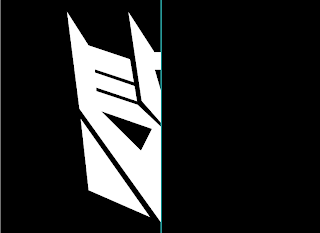
Go to View > Rulers (Ctrl + R). While you are on the logo layer, drag a guide from the side to the center of the document. With the Pen Tool, trace only the left half of the logo.

There is no need to trace the right half, because the two sides are symmetrical.


Step Three: Forming the logo shape
Create a new layer above the background layer and name it "Logo Left". With the Pen Tool selected, right click on the path you made in the last step and select "Make Selection". Go ahead and fill the selection with White (#FFFFFF)


Duplicate the Logo Left layer (Ctrl + J) and name it Logo Right. Select the Logo Right layer and go to Edit > Transform > Flip Horizontal. Drag it to the center of the document so the edges line up with the Logo Left layer. Merge the two Logo layers (Ctrl + E merges the layer with the one below it) and name it Logo Base.


Step Four: Give it some texture

Open up BG_texture (6) from the texture pack we downloaded at the beginning and resize it so it fits the canvas nicely.

Select the texture layer and go to Image > Adjustments > Desaturate.

Ctrl + Click the Logo layer and apply a layer mask the to the texture layer. Rename the texture layer to Base Texture. You should end up with something like this:


Step Five: Forming the inner bevel
Ctrl + Click on the logo layer to make it a selection. 
Then go to Select > Modify > Contract and enter in 5px and push OK.


Create a new layer above all the others and name it Logo Bevel.
Fill it with Black (#000000)


Step Six: Small touch ups
As you can see, there are some spots where the Contract we did in the last step rounded the edges.


Select the Eraser Tool and erase inside the outline and make the corners pointy again.


Step Seven: Add some depth
Drag the same texture we used in Step Four onto the document again, desaturate it, and make sure it is on the top layer. Name this Bevel Texture.
Ctrl+ Click on the Logo Bevel layer and apply a layer mask to the top texture layer that we just added.
Click on the Base Texture layer and go to Image > Adjustments > Brightness/Contrast and set the Brightness to -80. Click OK.

At this point you can delete the Logo Base and Logo Bevel layers.
Select the Base Texture layer and use the Dodge and Burn tool to give the edges some highlights and shadows.


Step Eight: Gradient Overlay
Select the Bevel Texture layer and go to it's Blending Options. Click on Gradient Overlay and set it as shown:


Step Nine: Adding some cracks
Create a new layer above all others and name it Cracks. Set the blend mode of this layer to Overlay. Load up the crack brushes you've downloaded and put a few different ones on the mask. 


And you're done!


Read more >>

Wednesday, June 13, 2012

Simple Energy Swirl

0 comments
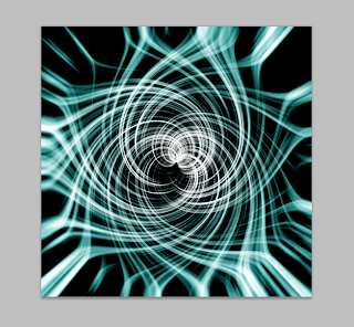
Hello boys and girls, today I'll be teaching you how to make a fairly simple and quick energy swirl.


Here is a view of what we will be making:


Thing's you'll need:
•Photoshop
•Around 5-10 minutes

Let's get started!

1. Open up Photoshop and create a new document that is square shaped. I'll be using a 500x500 canvas size.


2. Fill the background with black and go to Filters > Render > Fibers and set the Variance to 20, and the Strength to 7. Press OK


3. Next you'll go to Filters > Distort > Polar Coordinates and press OK.


4. After that you will need to blur it a bit so the lines aren't so rough. Can't have a rough energy swirl. Make your way to Filters > Blur > Radial Blur and set the Amount to 100, the Blur Method to Zoom, and the Quality to Best. Click OK


5. Now we need to lighten the white up a bit. Go to Image > Adjustments > Levels and apply the following settings.


6. Press Ctrl + J (or Command + J if you are on a Mac) to duplicate "Layer 1". Select "Layer 1 Copy" and set its Blending Mode to Screen. Next thing you'll want to do is go to Filters > Distort > Twirl and change the Angle to 250°. Press OK and then select "Layer 1". Go back to the Twirl filter, but this time change the Angle to -250°.


You should end up with something that looks like this:


7. Since black and white is a bit plain, we will spice it up with some color. Create a new Layer and name it "color". Change it's blending mode to Soft Light. Select the Gradient tool and choose a color on the left side, and leave the right side black. I chose the color #3a9693 . Start your gradient in the center of the swirl and drag it outwards. Try it a couple different time until you get an effect you like.

Here is my finished product.

That's all for today! 

I'd love to see your finished product! Feel free to upload them to Imgur.com and leave the link in the comments!
Read more >>